this is my first draft and idea of how i see my music magazine
it photographed a female in the middle of the page. The female will have her hair down showing 'swag' and she will be surrounded by coverlines.
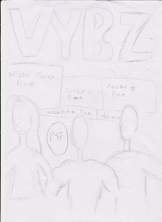
this is my second draft with a 'vybz' masthead. this shows the kind of vibe the magazine brings to its audience. it consists of three artists. the male in the middles is topless with masculine muscles and also a female next to him to balance the kind of audience it attracts.
my third draft consists of two masculine, topless artists. i came up with a new masthead to bring a new meaning to my music magazine. it will consist of high lighting and coverlines written in different colours from the main coverline.
my fourth draft consists of a different masthead and three different images of different artist. the main image is placed in the middle of the magazine and the two other images placed on each shoulder, showing the hierarchy between artists. the coverlines and dateline are placed below the two images leaving the main coverline at the top next to the masthead.
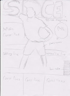
the fifth draft i came up with consist of an artist in the middle of the magazine in a medium long shot showing the artist raising both hands in the air. it include a selling line at the bottom of the masthead to show a relationship between my music magazine and the audience it targets.
the sixth draft i came up with allows my coverlines to be at the bottom of the page because the main image is a medium long shot placed at the top of the magazine. the artist is to catch the audience eye at the first glance. it consist of a female artist posing in a super hero position to connote the kind of topics the magazine brings in the music industry.
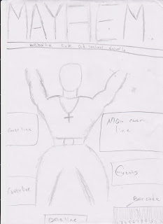
my second to last idea brings the idea of ethnicity in my music magazine. a black artist in the middle wearing jewellery showing wealth and where black people stand in the music industry. i included puff and coverlines at the side of it making him seem more important.
my last draft consist of three boxes of different images and not having a main image. this is to show the equality between the artist and the main coverline is written at the bottom left corner, allowing the audience to see it first if its been placed in a shop and giving information about the three artists. it comes with a puff and selling line.


No comments:
Post a Comment